

A generated image can look convincing at first glance and still fail when placed in an article, advert, product page, or social post. The central object may change shape, a label may be wrong, the composition may fail under a mobile crop, or decorative text may become unreadable at publishing size. These problems are easy to miss when review simply asks whether an image “looks good”. A useful review must test whether the asset does the job it was created to do.
Generation and approval are different tasks. Prompting advice can produce a stronger first version, but it does not explain what to inspect before publication or how to correct a result without introducing new faults. When an existing image needs a focused change rather than a new concept, Image 2.5 API is one possible route for working from text instructions or a reference image. The wider method is tool-independent: define the publishing context, compare the result with the brief, isolate failures, and decide whether editing or regeneration is safer.
Start With the Intended Publishing Context
Do not review an image only in the generator window. Put it where it will actually appear, or recreate the important conditions. A wide blog header, square social post, and narrow mobile card can reveal different weaknesses. A subject that feels balanced in a large preview may be clipped by a responsive crop. Fine typography may look sharp at full resolution but become visual noise when reduced.
Write down three things before checking details: the destination, required focal point, and any information that must remain accurate. For a campaign graphic, the focal point might be a product or person, while protected information could include a logo, headline, date, or packaging detail. This list becomes the basis for review. If you cannot state what must survive publication, judging whether the visual has passed becomes difficult.
A useful first test is the three-second glance. View the asset at its real display size, look away, then ask what you noticed first. If the intended subject did not win attention, the problem may be composition rather than rendering quality. Sharpening or adding detail will not fix weak visual hierarchy.
Run a Structured Visual Quality Check
A repeatable check prevents reviewers from being distracted by the most attractive part of an image. Work from large, meaningful elements towards smaller details. The following sequence is short enough for routine assets while still catching failures that survive a casual glance.
1. Check the Subject Against the Brief
Compare the main subject with the original requirement or reference. Look at identity, silhouette, proportions, clothing, product shape, distinctive colours, and recognisable features. Do not settle for “close enough” when accuracy matters. If a bottle becomes taller, a jacket gains a different collar, or facial features drift, record that as a subject failure even if the image remains attractive.
2. Inspect Text, Logos, and Small Details
Zoom in after the overall subject passes. Read every word rather than assuming text is correct because the layout looks plausible. Check logos, labels, dates, numbers, interface elements, signs, fingers, reflections, repeated objects, and subject edges. Small errors matter most when they alter meaning or make a real object appear inaccurate. Mark each issue separately instead of grouping everything under “needs polishing”.
3. Test Composition at the Final Size
Return to the size your audience will actually see. Check whether the focal point survives cropping, whether important text has enough space, and whether the eye moves through the image in the intended order. A desktop hero may need open space beside a headline; a social tile may require the subject closer to centre. If the image only works when viewed large and uncropped, it is not ready for a responsive layout.
4. Look for Unrequested Visual Changes
Finally, compare the result with what you asked to change. Generated edits can improve the target area while quietly altering something else. A background replacement might shift facial lighting, change an object’s colour, or move surrounding elements. Treat each unrequested change as a decision: accept it, correct it, or return to an earlier version. This prevents accidental drift from becoming the new baseline.
Fix One Visible Failure at a Time
Once the review produces a list of faults, resist rewriting the entire prompt. Broad revisions make it harder to identify which instruction caused an improvement and may disturb parts of the image that already passed. Rank failures by importance: factual accuracy first, then recognisability and layout, followed by cosmetic details. Correct the highest-risk issue and review the whole image again before moving on.
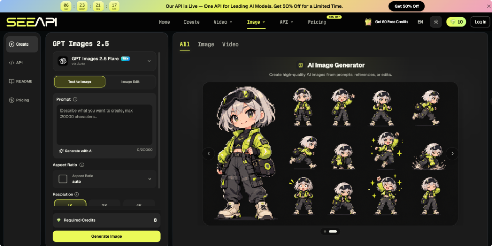
Suppose an editorial graphic has the right subject and framing, but the background is too busy and a required object has moved. For a focused correction, GPT Image 2.5 can take a reference image with written instructions for what should change and remain fixed. Use the approved image as the reference, specify the background adjustment, and state that the subject, framing, and protected object placement must remain consistent. Afterwards, compare those protected details with the previous version. The edit passes only if the target problem improves without creating another one.
Know When Regeneration Beats Another Edit
Editing is useful when most of the image is already correct. Regeneration is more sensible when the failure sits in the foundation of the composition. If the wrong subject dominates the frame, the perspective conflicts with the intended use, the scene communicates the wrong idea, or several protected elements have drifted, another local correction may create a chain of further fixes.
Use a simple threshold. If you can describe the problem as one visible change while naming several elements that must remain fixed, try an edit. If you need to rewrite the subject, camera position, environment, hierarchy, and message at once, return to the brief and generate a new direction. Preserving a weak foundation often requires more effort than starting again.
Consider a promotional graphic announcing a software update. The first version shows the correct device and colour palette, but the screen content is secondary to dramatic background effects. Removing one effect may not fix the hierarchy because the scene was designed around spectacle. A better regeneration brief would place the device and interface first, use quieter surroundings, and reserve negative space for copy. That changes the visual logic instead of patching symptoms.
If repeated edits keep introducing problems in different areas, stop treating them as isolated mistakes. Return to the last version that passed most checks, or rebuild from the original brief.
Build a Review Habit That Scales
A dependable publishing workflow separates approval from enthusiasm. First confirm the destination and protected details. Then check the subject, text, small features, composition, and unrequested changes in a fixed order. Correct one high-risk fault at a time and recheck the full asset after every revision. When the underlying scene is wrong or edits repeatedly cause drift, regenerate from a cleaner brief instead of stacking corrections onto a weak version.
Over time, save the failures that recur in your work. A team producing product graphics may repeatedly need to check label placement and proportions; an editorial team may care more about factual symbolism, headline space, and mobile crops. Turn those recurring risks into a short pre-publication checklist. The aim is not to make every generated image flawless under magnification. It is to make approval consistent, explainable, and tied to where the image will actually be seen.