
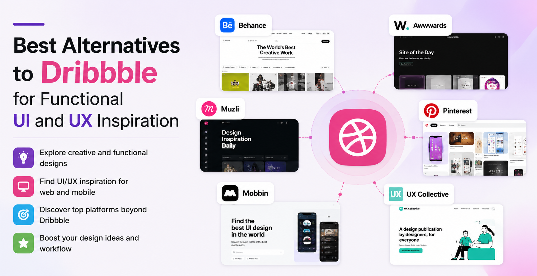
It’s very comfortable to browse through Dribbble. The gradients are smooth, the typography is intentional, and it’s as if it’s been designed by a person who has a workspace that they carefully design. At some point between being impressed by a nicely painted login screen and designing your very own product, you get stuck somewhere: none of it tells you how anything works.
Dribbble’s success was founded on its visual nature, and that’s where it still excels. The problem is that the design of a product has advanced beyond the stage of being adequately documented with pictures or screenshots. Whether it’s onboarding friction, checkout drop-off, multi-step form logic, or navigation architecture, modern teams are struggling with these problems and a well-designed mockup, no matter how sophisticated, can’t solve any of them. Context is important to designers: the screen before and the screen after and the logic that connects them.
This dissatisfaction is an ongoing issue throughout design communities. Practitioners refer to Dribbble as an eye candy site that doesn’t always provide them with useful information, and the rise of behavior-driven product thinking has stealthily led many practitioners to seek out other sources of reference that are more relevant to their work.
Page Flows: Inspiration Built Around Real Product Behavior
Of the tools gaining serious traction as Dribbble alternatives, Page Flows has earned its place by being built with a fundamentally different purpose. Rather than aggregating attractive screens, it documents complete user journeys from live digital products: web, iOS, Android, and email. Designers who want UI/UX Inspiration from Real User Flows that reflect genuine product decisions, not speculative ones, have increasingly made it a core part of their research process.
What Page Flows captures isn’t a single screen – it’s a full sequence. You can study how a SaaS product walks new users through its onboarding, or how an e-commerce app structures checkout from cart to final confirmation. These aren’t wireframes or design experiments. They’re screen recordings and captures pulled directly from production applications that have been tested, iterated, and put in front of real users. That distinction fundamentally changes how the material can be applied in practice.
What Makes It Different from Visual Galleries
The core value of Page Flows lies in what surrounds each screen. Most inspiration platforms treat a UI element as a self-contained artifact, something to pin, screenshot, or toss into a Figma mood board. Page Flows treats every screen as a node within a broader interaction system. You can see what precedes a particular moment, what decision the user faces, and how the experience continues from that point forward. For designers solving complex interaction problems, that kind of contextual documentation replaces hours of manual competitive research.
It’s especially effective for studying how established products handle friction-heavy moments, subscription upgrade prompts, password recovery flows, trial expiration screens, and multi-step checkout progressions. Seeing how products like Notion, Figma, or Duolingo approach these exact situations in their actual production interfaces gives design teams a reference point that no concept board can replicate. Beyond full flows, the platform also organizes individual screens by product category and interaction type, so a team can quickly surface examples of pricing pages, empty states, or error messages without losing the functional context that makes each one worth studying.
Using Flow-Based Research in Real Product Work
One of the strongest applications of this kind of platform is competitive UX research, which is precisely where flow-based documentation separates itself from traditional inspiration galleries. When designing a new onboarding experience, being able to compare how several well-known products structure that same journey – step count, copy tone, friction placement, progressive disclosure strategy – gives you a qualitative foundation that directly supports real design decisions.
This matters because product designers rarely operate in isolation. Stakeholders ask why something is structured a particular way, and “it looked compelling on Dribbble” doesn’t hold up in a product review. Being able to point to how multiple shipping products approached the same challenge provides rationale that moves conversations forward – grounding design choices in observed behavior rather than personal aesthetic preference.
The Efficiency Case for Starting From Real Flows. There is also an argument of practical efficiency. If your product requires account deletion confirmation, a referral incentive flow, or a cancellation experience, Page Flows has probably documented how other companies already handled it. Referencing the real world reduces the time required for iteration, and leads to design outcomes that are easier to defend, validate and build upon.
Conclusion
The overarching lesson is that it’s a matter of intention. There’s nothing wrong with Dribbble as a tool. When it’s actually what you’re looking for, it has a place in visual trends, typographic strategies and color directions. But it was never designed to answer any questions about interaction structure or user progression, and if it’s used as a main UX reference, there’s a disconnect between the inspiration and the execution that often shows in the final product.
For teams doing serious product work, the most actionable references come from systems, not snapshots. They come from studying how real companies have tackled real design problems under real constraints – actual users, actual friction, actual business stakes. Platforms that document functional UX behavior don’t replace a designer’s judgment; they sharpen it by rooting decisions in how products genuinely perform once they’re live and in the hands of real people.